 Shop
Shop

For me, fine art paper has always been much more than just a technical surface for printing. It is part of the photograph itself. Perhaps this comes from the fact that I originally started with analogue darkroom printing and spent a great deal of time working with traditional photographic papers.
Back then, the surface of the paper felt almost physical in the process: the depth of the blacks, the way the emulsion reacted to light, the character of the gloss… All of this influenced the final image just as much as the photograph itself.
The importance of paper in fine art photographic printing
In analogue printing, I worked with papers from Ilford, Kodak, Agfa and Foma. Each material had its own personality. Some papers produced very soft matte images, while others created dense blacks and the rich depth associated with classic silver gelatin prints.
Even then, I found myself drawn to surfaces somewhere between matte and glossy: papers with a delicate reflection of light, but without an overly mirror-like shine.
From analogue printing to modern fine art papers
Analogue printing remained very important to me for a long time. However, over the years — while I was still living in Russia — the cost of materials began increasing dramatically. Photographic paper, chemistry and the darkroom process itself became increasingly expensive and difficult to maintain.
At the same time, I wanted more freedom to experiment with light, to work faster and to explore more complex visual ideas; and digital photography offered enormous possibilities for that.
Still, I did not want to lose the visual aesthetics of a good analogue print: the depth, the tactile quality and the physical presence of the image. This is exactly where the world of modern fine art papers became incredibly interesting to me.
Types of fine art papers for photography
Today, there is an enormous variety of materials for fine art photographic printing: cotton rag papers, baryta surfaces, pearl and satin papers, textured art papers, Japanese washi papers… and every surface changes the perception of the photograph completely.
Over time, you begin to notice how deeply paper transforms an image. It is not only about printing a photograph, but about choosing the material that best accompanies its light, texture, atmosphere and visual intention.
Matte cotton papers: softness and atmosphere
Classic matte cotton papers, such as Hahnemühle Photo Rag, create a very soft and quiet image. They diffuse light beautifully and give photographs a more atmospheric, almost museum-like quality.
They work especially well for black-and-white photography, minimalism and low-key portraiture. However, fully matte surfaces can sometimes slightly reduce the perceived sharpness and visual depth of black tones.
Textured papers: photography as an art object
Textured papers, such as Hahnemühle German Etching, create an entirely different feeling. Light interacts with the texture of the surface itself, making the print feel more tactile, more material and closer to an art object.
This is especially noticeable in large formats. At the same time, a very pronounced texture can soften some of the fine details, which means these papers do not work equally well for every photographic series.
Satin, pearl and baryta papers: depth and detail
Satin and lustre papers behave differently. They tend to hold microcontrast better, produce a deeper Dmax and create richer visual blacks.
Images printed on these surfaces often appear more detailed, denser and more contemporary. This is one reason why many fashion, portrait and contemporary photography artists prefer pearl or baryta papers for gallery prints.
My experience testing different photographic papers
Over the years, I experimented with many different materials: papers from Epson, including Epson Luster and Hot Press, various Fujifilm papers, classic cotton papers and baryta surfaces.
Gradually, I realised that I was most drawn to materials that preserve something of the feeling of classical analogue photography, while still benefiting from the possibilities of modern fine art digital printing.
Why I use Ilford Galerie Smooth Pearl 310 gsm
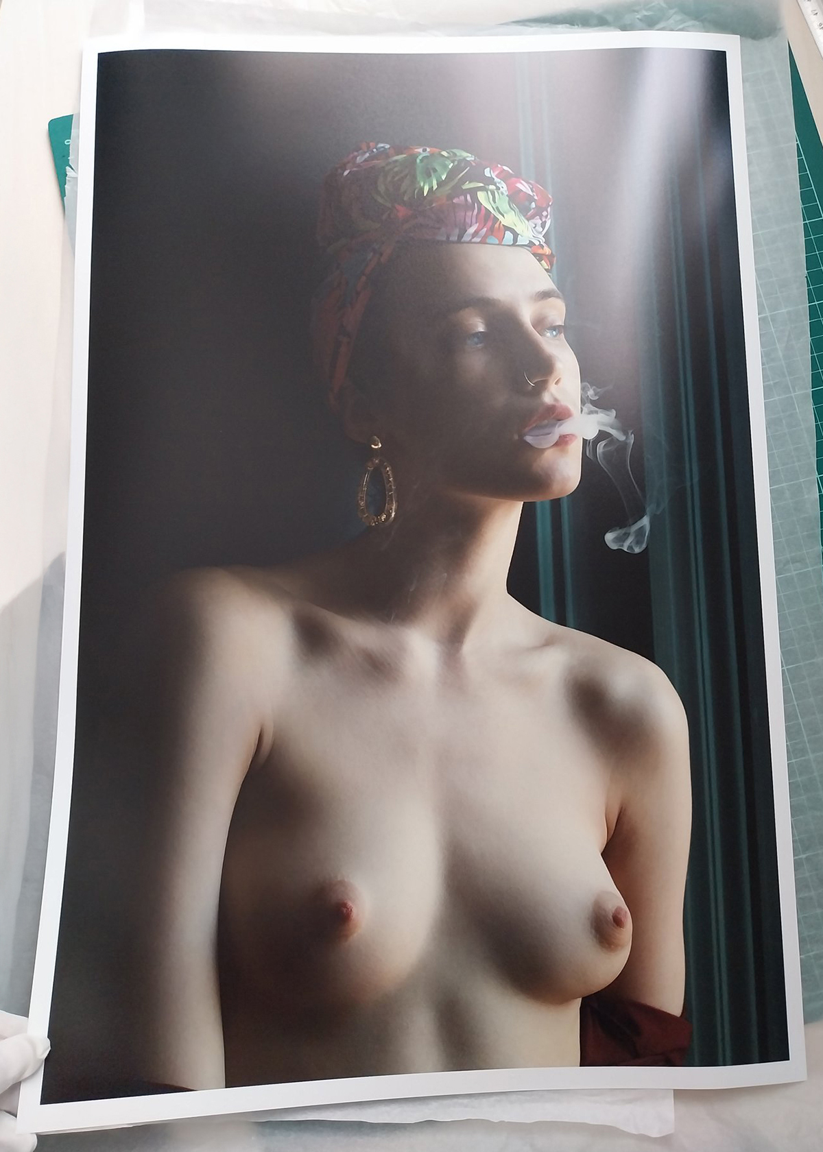
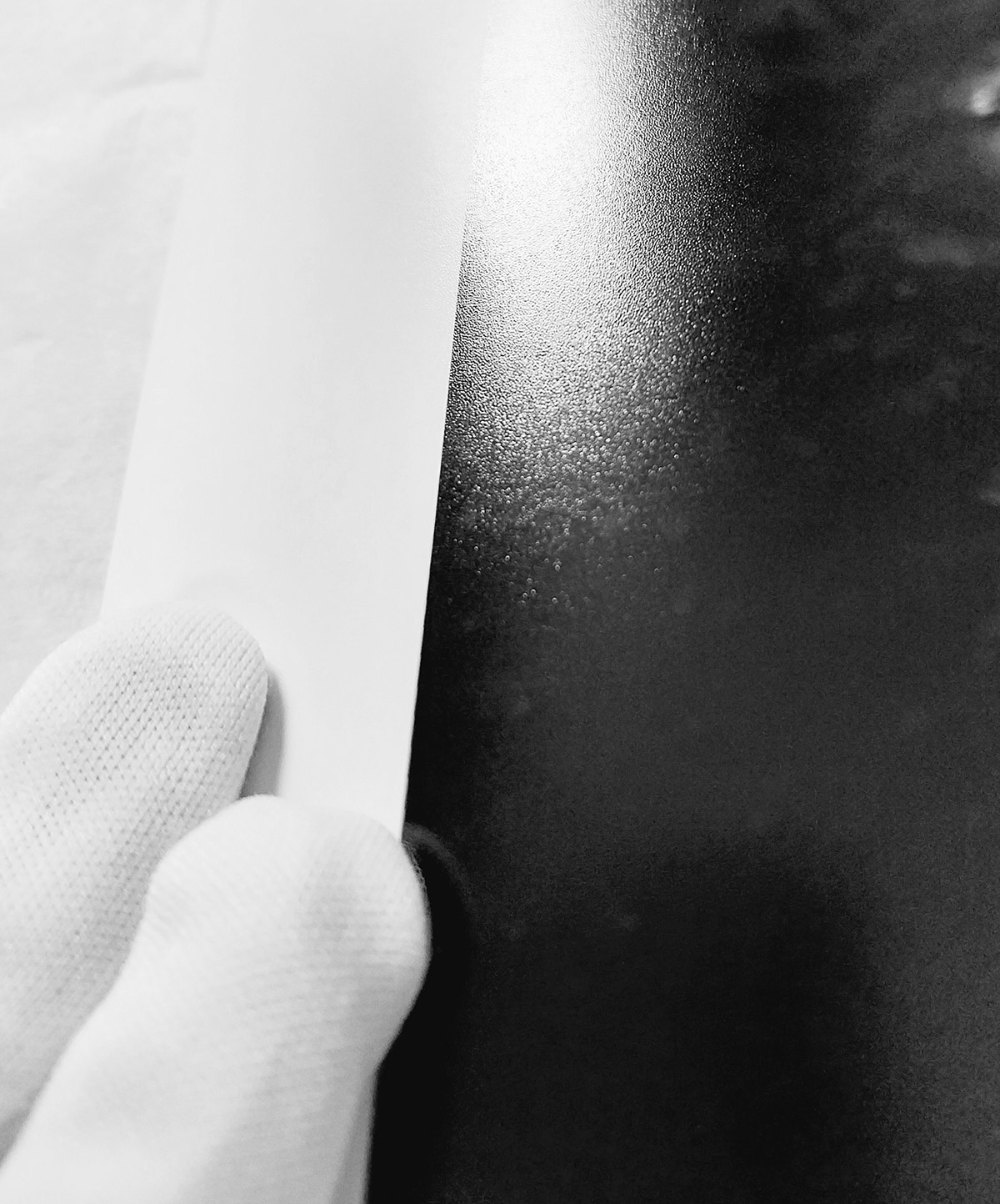
Eventually, I settled primarily on Ilford Galerie Smooth Pearl 310 gsm for most of my work. For me, it offers a very beautiful balance between contemporary fine art printing and the aesthetics of analogue silver gelatin photography.
What I particularly like about this paper is its calm and elegant surface. It has a very soft pearl sheen — not overly glossy — but at the same time it is capable of creating great depth and density in the image.
The paper holds blacks very well, creates excellent separation in the shadows and renders skin tones in a very natural way, which is especially important in portraiture and fine art nude photography.
The physical presence of a fine art photographic print
I also greatly appreciate the physical quality of the material itself. The 310 gsm weight gives the print a stronger, more physical and more material presence.
For me, this is especially important because I send many works to collectors and buyers in different countries. The paper needs not only to look beautiful, but also to withstand transportation well and preserve the presence of a true fine art photographic print.
Choosing the right paper for each photographer
I believe that, over time, every fine art photographer begins searching not simply for a “good paper”, but for a material that aligns with their own way of understanding photography.
For some, it may be completely matte cotton paper. For others, the deep blacks of baryta or the delicacy of Japanese washi papers.
For me, the closest connection remains with those papers that preserve something of the feeling of classical photography: soft light, delicate sheen and the physical presence of the image.